User:JamesCrook/WD-PR2
| Progress reports, produced roughly every two months, about the toolbox interactive wiki diagrams code. |
| See: PR1, PR2 and PR3 |
Contents
Progress Report 2
For start of April 2020
Parallels: Biochemistry and Code
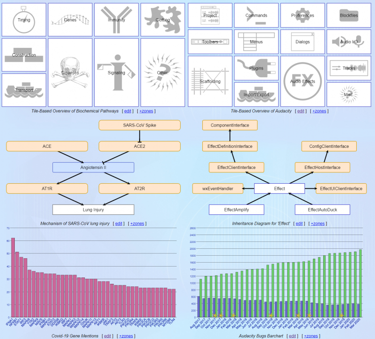
Some of the diagram types are now used for both biochemistry (left) and source code (right).

Here are the biology related demos.
Master-Detail and Tooltips
The three types of diagram above each have the large tooltips, so more textual information can be available from an image than in conventional images and plots.
- The large tooltips are a hybrid that combines the advantage of a tooltip and master-detail display. They take up space only when needed, as tooltips do. Like a master-detail details panel, the large tooltips have more space than a normal tooltip does, and they are more 'visually stable' in their positioning.
- The 'zones' drop-down beside the image caption also solves one problem of tooltips, that you may not always know what has tooltips just from looking at a diagram. The 'zones' and tooltip combination also means you can often dispense with many labels on a diagram and dispense with a key. The information is available, if wanted, in the zones list.
Diagrams and Styles
The diagrams are generated from text, editable in wiki, and are becoming more flexible, with more styles for arrows, bars, labels and markers. Work is in progress on unifying the approach so that the styles behave 'the same' on different diagrams.
KWIC Browser
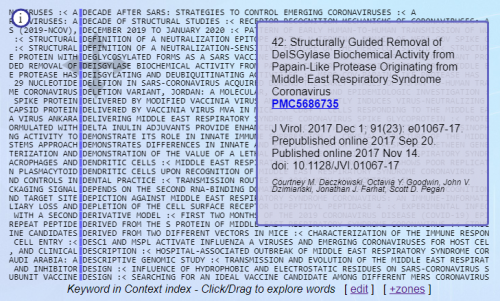
I've added a Keyword in Context Browser. It speeds up navigation through a large number of titles of papers. You click on a word in the KWIC index, and the list sorts itself anew to show titles that have similar word sequence. Details of the papers are in the tip that is to one side.
Currently this index is for papers about coronavirus. I also plan to use it to navigate through descriptions of different classes in Audacity. Here's a live demo of it.
Snakes Display
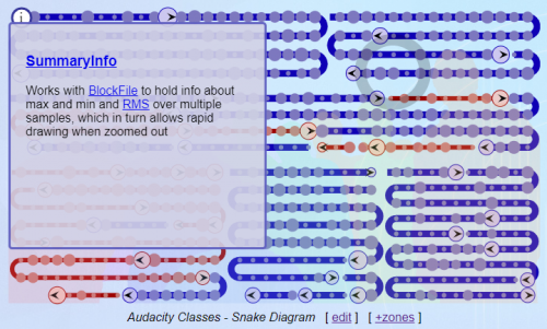
The snakes display has progressed a little, mainly in styling.
In the image above, the user has hovered over a spot on one of the 'snakes' that corresponds to Audacity class 'SummaryInfo', giving a tip panel with a link to that section. The snakes and spots on them are starting to act as an index, visually organising the information. Red snakes are about generic features in Audacity code, blue snakes about code that is more specific. The snakes are slowly progressing towards being a 2D metro-map for biochemical pathways, and a 'metro-map' for information about Audacity source code.
Other Changes
Some other changes in the last two months:
- Support for SVG Images, and opacity. A gotcha was that SVG text is not supported.
- Better hyperlinks, easier to use, automatically generatable into templates for tip text.
- Additional styles; Blunt arrows (for inhibition of a step), more metro-like stations on snake diagrams.
- Programmatic modification of a diagram, after loading (used currently to highlight sections).
- Convenience objects - 'Spacer' to help with layout. 'Tile' combines image, text and rectangle.
Lessons / Insights
- The space subdivision approach I'm using is too fragile and too cumbersome for ordinary users. I may reuse the optimiser that places molecule atoms, so that users have a higher level way to specify layout.
- I need more features for including one diagram into another - with modification. Sometimes one wants fine control over a sub image. Sometimes one want only coarse control. That requires 'different interfaces' to the same sub diagram.

